The Market Is A Time Bomb And Other Observations
"I don't want any more bullshit any time during the day. From anyone. That includes me." - Jack Rebney
As I said on my podcast over the weekend, I’m at the point where I’m throwing my hands up in the air and can honestly say I have no clue where the market is heading next.
On one hand, you have the “animal spirits” (read: hysteria driving the market higher right now) crowd, with everybody hypnotized to think there is literally going to be a “soft landing” from our current monetary policy setup, and on the other hand, we are arguably the closest we have ever been to smashing face first into the brick wall of mathematical reality that accompanies high interest rates.
Over here in Substack-writing land, I’m starting to feel like Winnebago Man.
“My mind is just a piece of shit this morning!”
Ergo, my thought process opening July is the same as it’s been for the last while, with the underlying theme being: even if I can’t predict where the market is going, it still doesn’t seem like a time to become complacent.
It’s really easy for a market like this to lull participants to sleep, convincing them that everything under the surface is operating as it normally would, and that there’s zero need for concern.
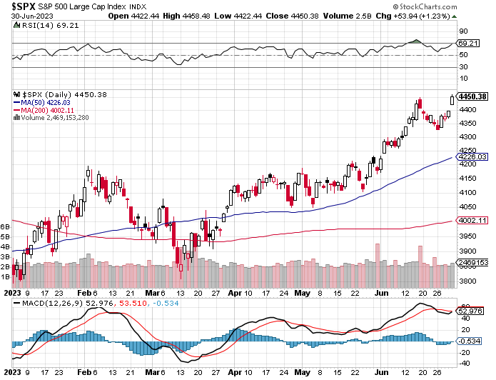
Of course, that’s the message that a stock market that looks like this over the last 6 months is sending:
From looking at the above chart, you’d never know the following about 1H 2023:
Russia is at war with Ukraine
China is considering taking Taiwan
There was just a failed coup attempt in one of the world’s largest nuclear powers
Russia, China and the BRICS nations are actively challenging the U.S. dollar
The U.S. is $31 trillion in debt and running a deficit
Interest rates are at 5% and have accelerated the quickest in decades
We just had the second largest bank collapse in the U.S. and names like Credit Suisse needed to be bailed out overseas
The commercial real estate sector is a well known air pocket
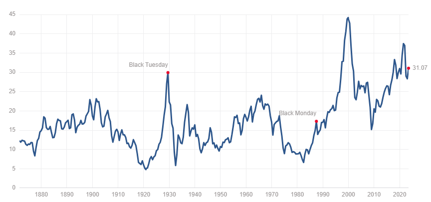
Yet despite the above (and numerous other negatives I’m not listing, not the least of which is our President’s inability to distinguish Ukraine from Iraq), the market trades at a Shiller PE of 31x, above the levels it was at during both Black Tuesday and far above its levels during Black Monday. It’s also about 10% higher than its level during the 2008 crisis.
For comparison, the Shiller PE is now at about twice its median of 15.93x and almost twice its mean of 17.03x.
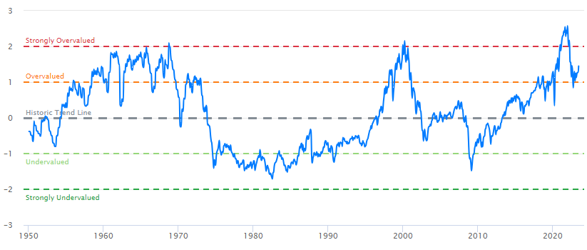
Nearly every other metric over at Current Market Valuation continues to indicate the same. The Buffett Indicator (market cap/GDP) pins us somewhere between “overvalued” and “strongly overvalued”, at about 1.5x standard deviations from its trend.
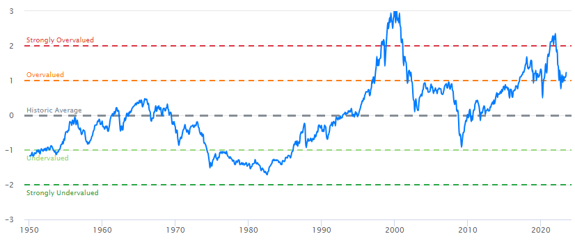
Looking again at a price/earnings model, we see that the current CAPE value as a # of standard deviations from the average is also above 1x.
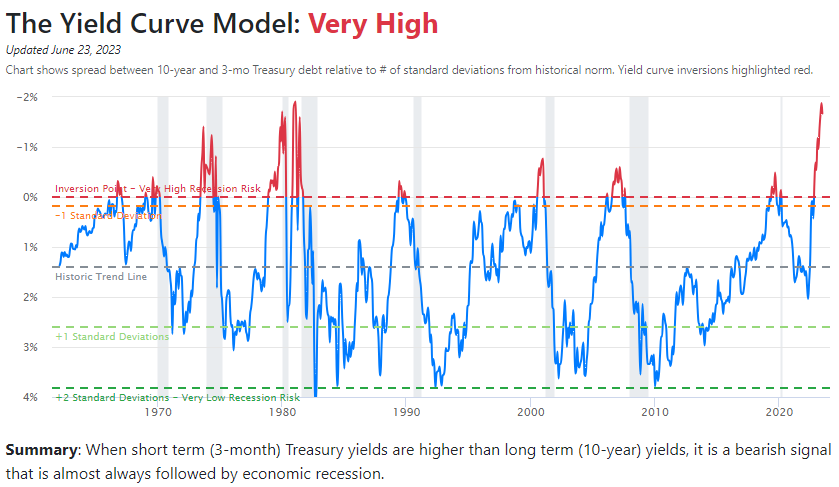
Most interesting of these metrics is the yield curve, which has been screaming recession for months (I pointed this out all the way back in February, whilst the bond market was malfunctioning, albeit not quite as much).
The idea is with the yield curve, as I noted then, is that inversion sends a signal to the market that investors are expecting near-term rate cuts (hence why longer dated maturities price in lower yields than nearer term maturities, which reflect closer to the actual rate). Usually the spread between the 10 year and the 1 or 2 year is the focus.
For example, if rates are 5% today, a 6 month Treasury bond could have a near 5% yield. But if a 10 year bond has a 3.75% yield, it’s an indication that in the time between the 6 month maturity and the 10 year maturity, the market expects the going rate of bonds to move lower (usually the longer maturity carries more risk, and the yield is higher). The bigger the spread between the two bonds gets, the more the market believes rates will diverge from where they currently are.
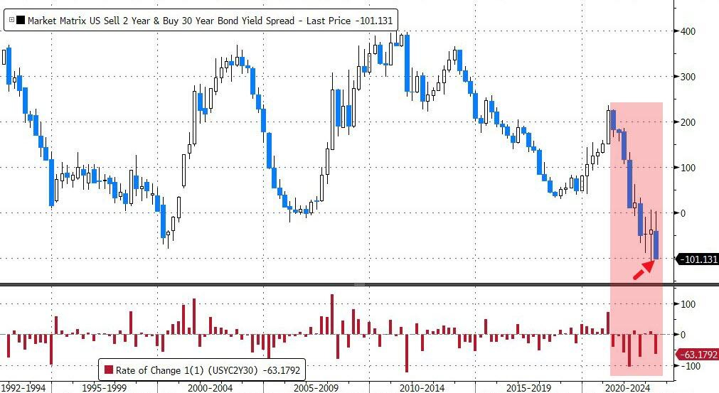
And so, Zero Hedge did a great wrap up of where the market stands versus the economy at the end of the first half of 2023. In that writeup, it noted that the yield curve ended Q2 at its most inverted quarterly close ever.
Under “Recession Indicator Models” on Current Market Valuation, it also notes that the yield curve is screaming that a recession is coming.
While it’s not proof positive of anything, almost always when the bond market sends this signal, volatility winds up following. I’m certain that this instance will be no different. The bond market is screaming that we will see a market crash, rates cut, a recession and/or all of the above.
As I said on my podcast over the weekend, I honestly don’t believe this is the time to be complacent. Despite what the VIX is showing up and the impression that we are heading for a soft landing, I’m going to continue to err on the side of caution (and, well, math) and continue my portfolio positioning the way that I have.
I don’t know what the timing of such volatility will be, I only know that personally, I believe is still is not a time to “set it and forget it” as it relates to the market. I think we are awfully overextended on basically any metric you can find. The only thing left is for the economy to drop out from underneath the market. That’ll remind everyone in short order that QE is over and, this time, bad news really is bad news.
For a list of what I own and how I’m personally positioning myself, check out my portfolio review, released just a couple of days ago.
Have a great short week.
QTR’s Disclaimer: I am an idiot and often get things wrong and lose money. I may own or transact in any names mentioned in this piece at any time without warning. Contributor posts and aggregated posts have not been fact checked and are the opinions of their authors. This is not a recommendation to buy or sell any stocks or securities, just my opinions. I often lose money on positions I trade/invest in. I may add any name mentioned in this article and sell any name mentioned in this piece at any time, without further warning. None of this is a solicitation to buy or sell securities. These positions can change immediately as soon as I publish this, with or without notice. You are on your own. Do not make decisions based on my blog. I exist on the fringe. The publisher does not guarantee the accuracy or completeness of the information provided in this page. These are not the opinions of any of my employers, partners, or associates. I did my best to be honest about my disclosures but can’t guarantee I am right; I write these posts after a couple beers sometimes. Also, I just straight up get shit wrong a lot. I mention it twice because it’s that important.



ROFLMAO!!! Winnebago man! This video clip alone with worth 10x my paid subscription to QTR. We need these little gems to remind us that, in spite of the 'shitstorm' around us, we are all human and need to treat others a hell-of-a-lot better. Oh...and could you include this link of The Trailer Park Boy's Jim Layhey's ShitStorm montage: https://youtu.be/tjMkqFmRGL4
My recent favorite is ratio of SPX to M2 money supply, which shows about 120 points of upside and 1130 of downside.
Printing is the trend, but SPX can only get so far away from M2 in my mind.
Caveat: The 2000 peak was up 46% from here. My 120 points call is based on Mar 2007 and Nov 2021 peaks.